UX/UI design / app case study
Wildlife Charity App
2022
A conservation-focused donation app concept designed to help users find trustworthy organizations, understand their impact, and donate with confidence.
Project overview
Designing a clearer donation experience for conservation causes.
With wildlife extinction rates rising, I explored the challenge faced by people who want to support animals but feel unsure where to donate or how to see their impact. Many charity websites offer broad donation categories, but fewer place specific emphasis on conservation and transparent impact reporting.
Identified a trust gap in conservation-focused donation experiences.
Shifted the information architecture after user feedback.
Designed symbols and page hierarchy to support quick decisions.
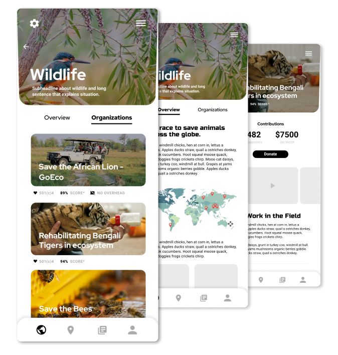
Built a prototype that balances emotional cause discovery with clear donation action.
Research themes
Finding the signals that make users trust a cause.
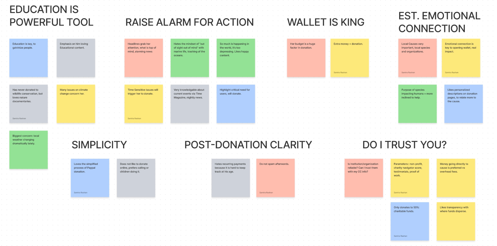
Early research surfaced repeated user needs around education, urgency, emotional connection, simplicity, post-donation clarity, and trust. Those themes shaped the app structure and the information shown before a user decides to donate.
Competitive analysis
Understanding how conservation donation sites build trust.
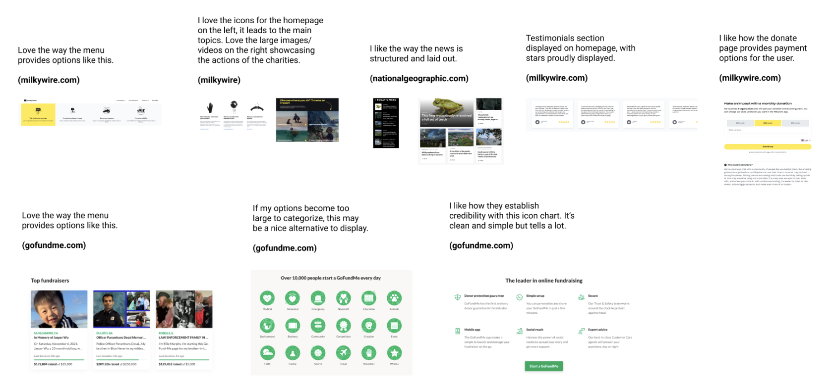
I evaluated websites that prioritize conservation as a core cause, looking at website design, user experience, donation process, transparency, impact reporting, branding, messaging, and engagement strategies.
Process
Changing the structure after user feedback.
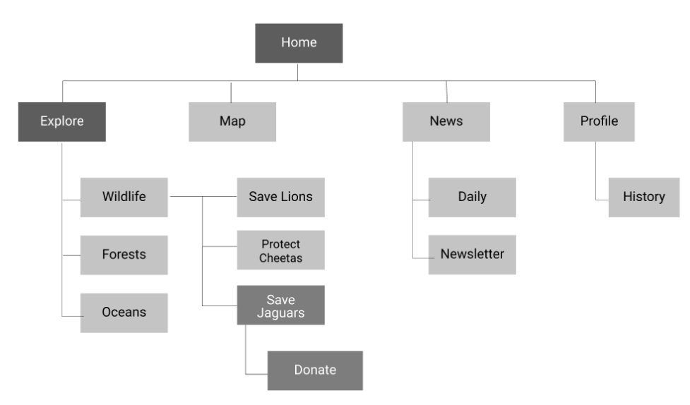
The early site organization focused on specific species. After gathering user feedback, I shifted to broader categories: Wildlife, Forests, and Oceans. This made it easier for users to explore causes, compare organizations, and make informed donation decisions.
Sketching and wireframing
Separating overview from organization detail.
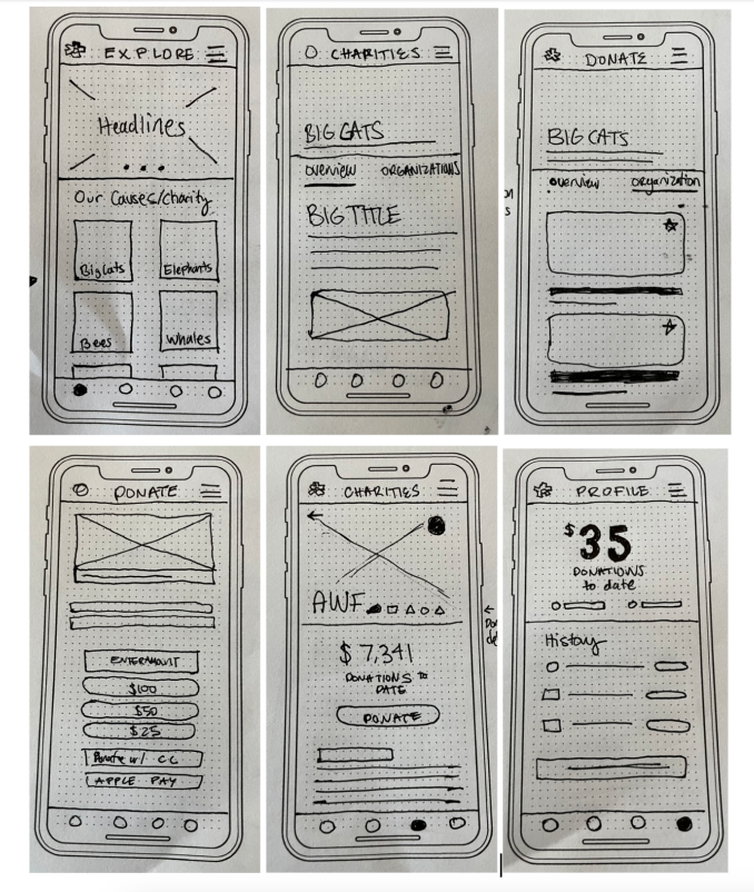
The strongest UX story here is decision support: helping users understand the relationship between causes, organizations, credibility indicators, and donation actions.
High-fidelity prototype
Making the app feel trustworthy, clear, and approachable.
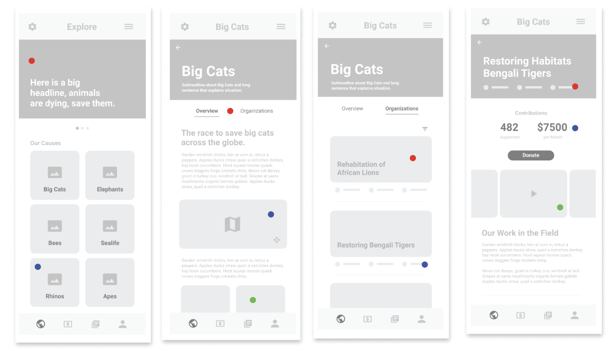
In the final prototype, rounded rectangular elements created a more welcoming feel, while a bold futuristic subheader font suggested reliability. Icons helped users quickly identify each charity’s status, rating, and other relevant details. The donation flow was designed to be simple, clear, and easy to track through the Profile section.
Next project
Dev Fair Trade Chocolate