Brand identity / logo redesign
NAHREP Rebrand
2019
A refreshed identity connecting NAHREP’s housing roots with its broader economic empowerment mission.
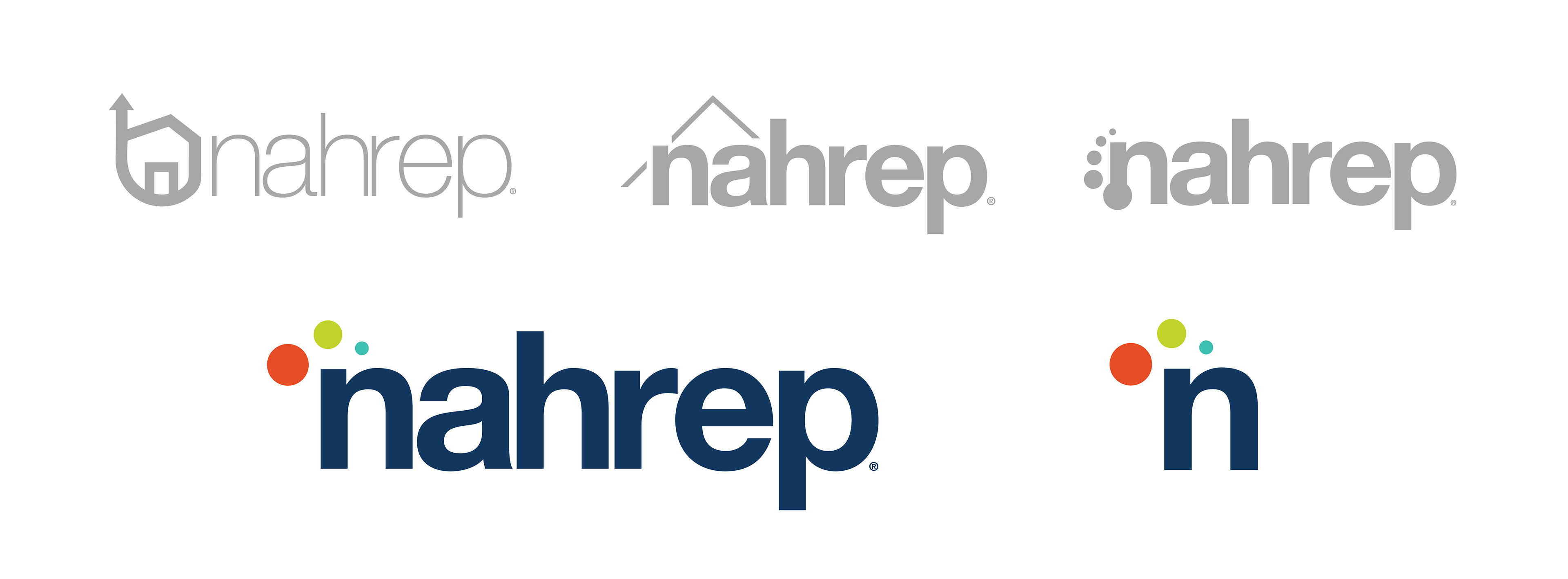
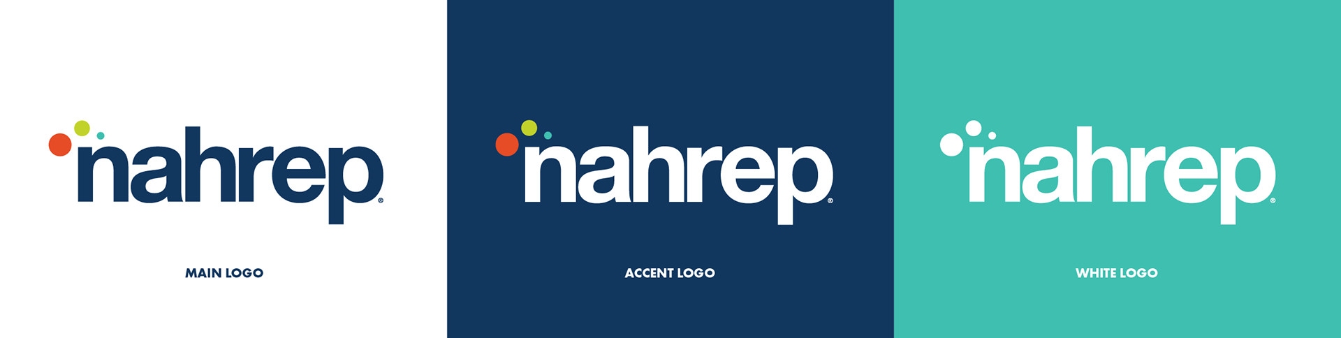 New lowercase logo system
Project overview
Updating an established advocacy brand.
The board wanted an identity that reflected NAHREP’s expanding role in housing and economic empowerment. I modernized the mark while retaining a link to its history.
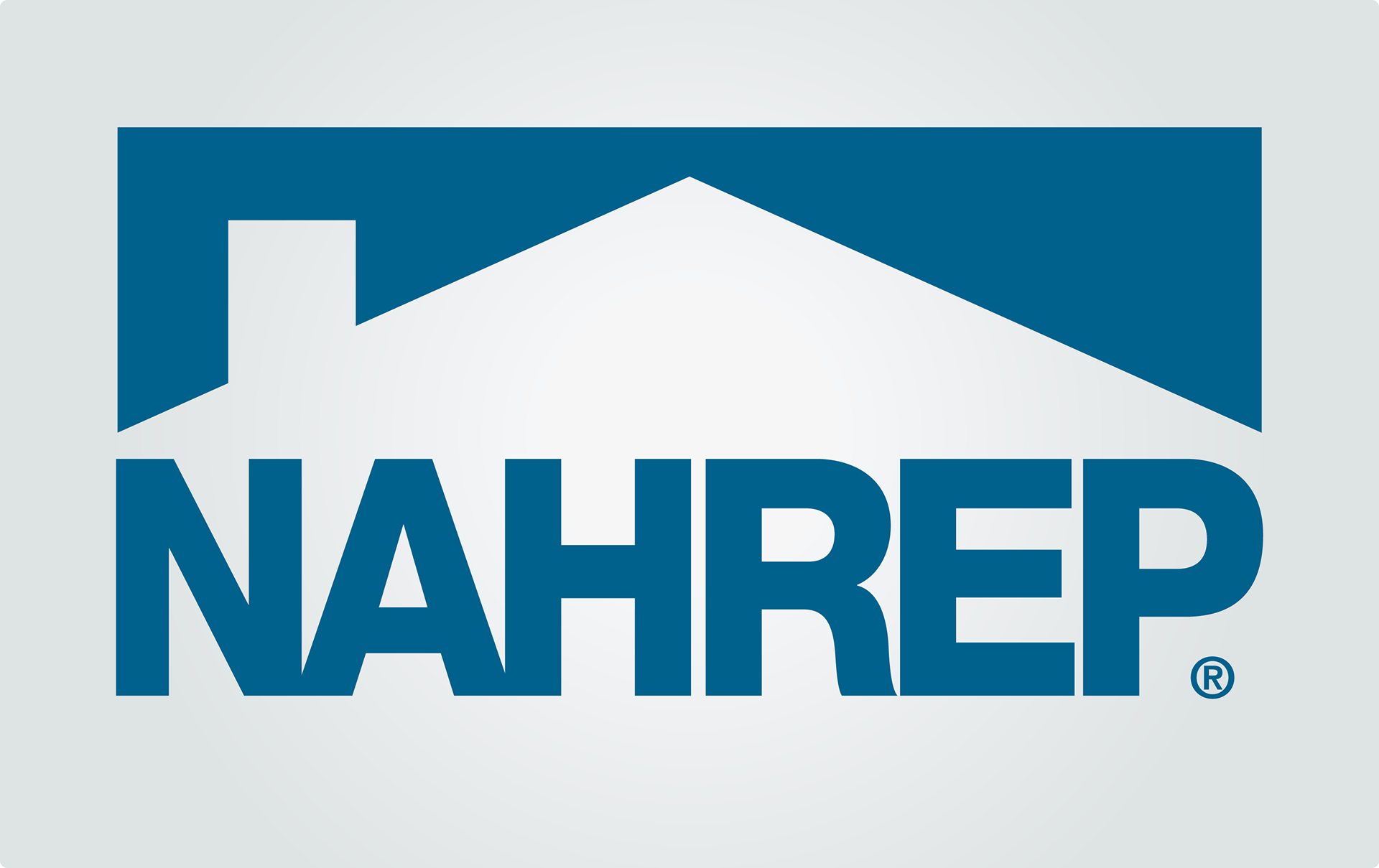
Previous logo
Starting with what already worked.
The original rooftop symbol established NAHREP’s housing connection. The redesign carried that reference into a broader identity.
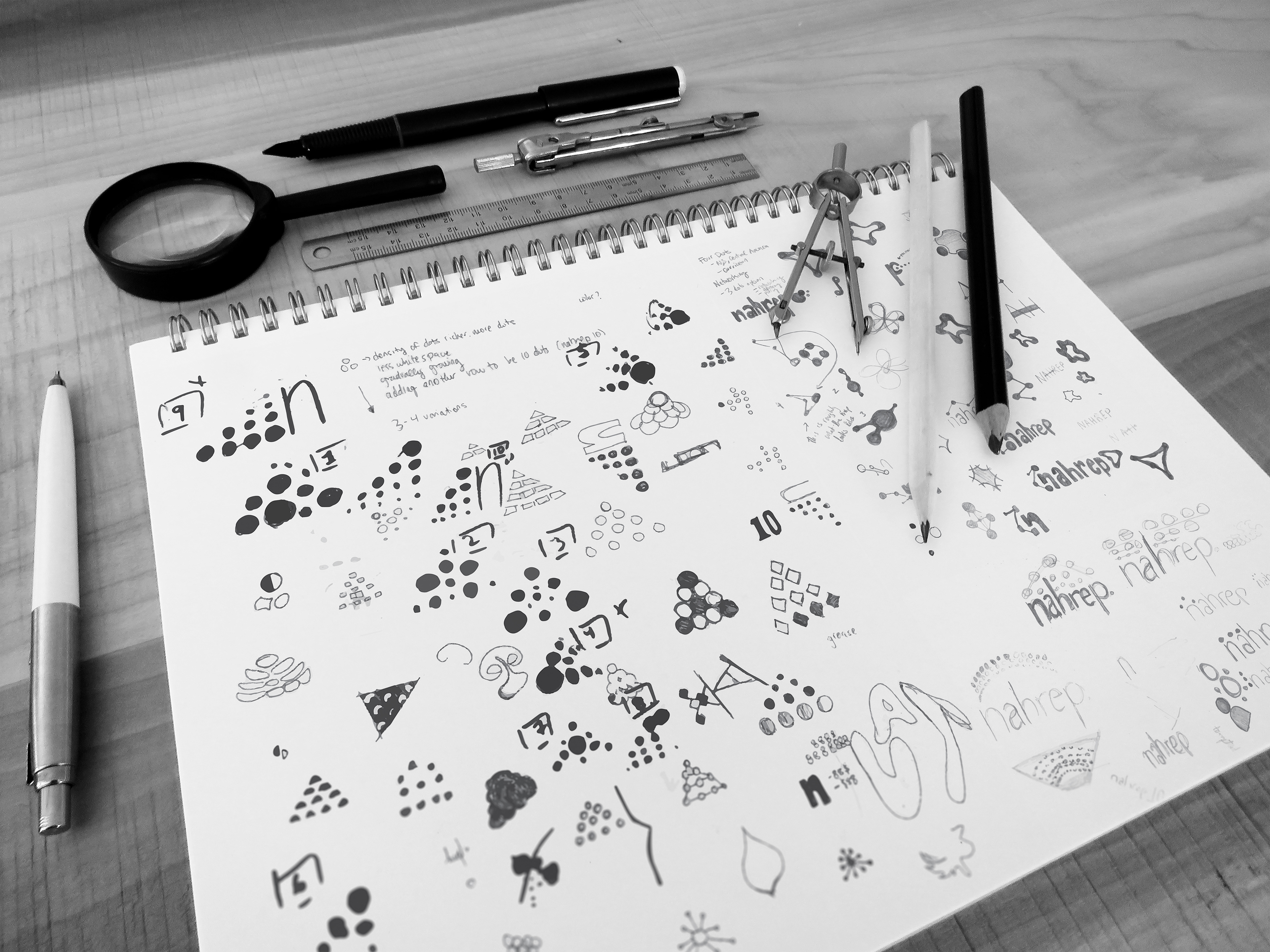
Fonts and colors
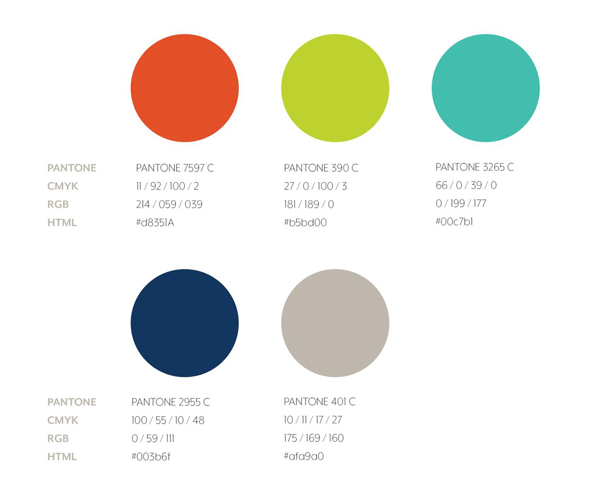
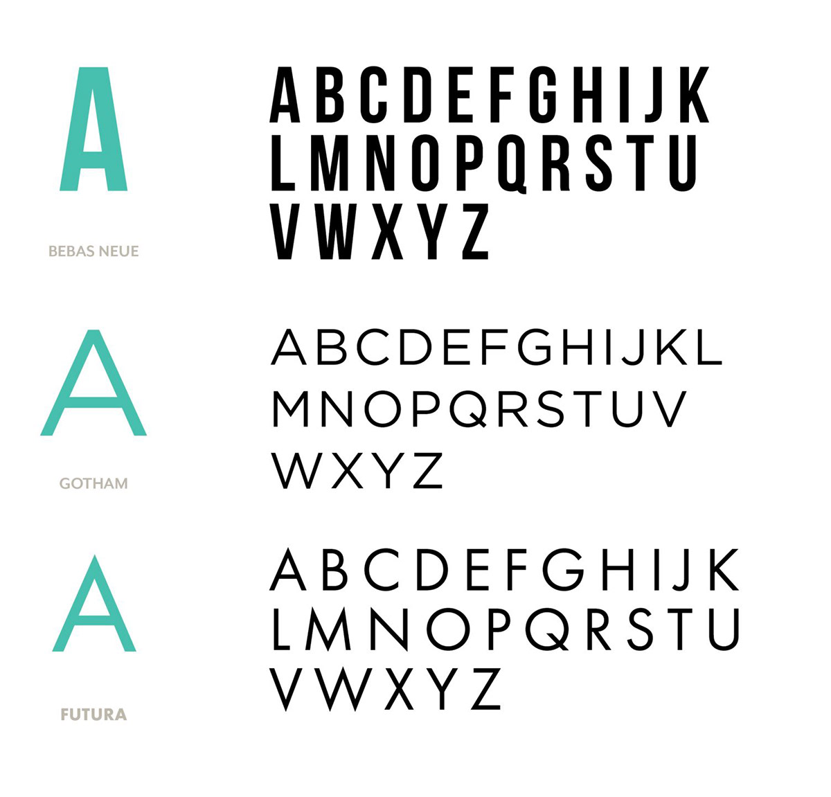
A brighter palette and modern typography.
Vibrant colors reflect the organization's culture and membership. Futura gives the identity a clean, modern foundation.
Bringing it all together
A final mark with mission built in.
Three dots represent education, advocacy, and networking. Their rooftop arrangement preserves the connection to real estate.
Next project
Suture Product Line Brochure