Brand identity / logo redesign
NAHREP Rebrand
2019
A brand refresh that modernized NAHREP’s identity while keeping a visible connection to its housing advocacy roots.
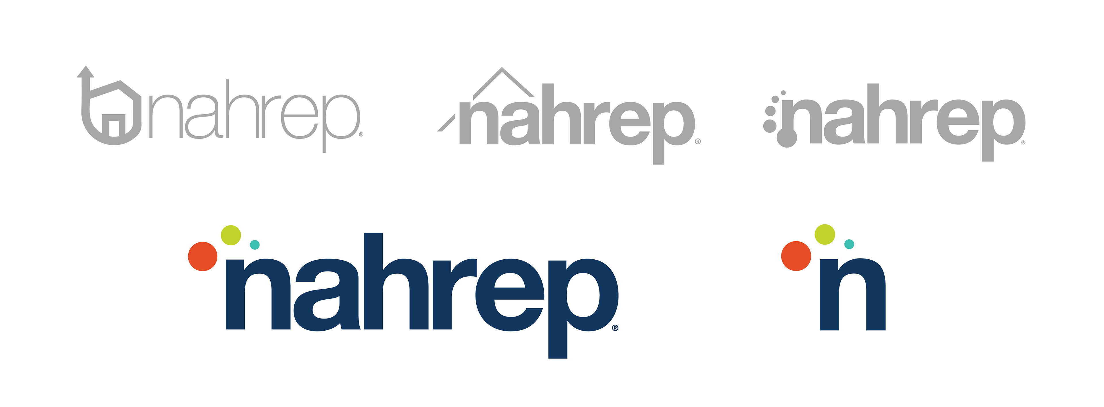
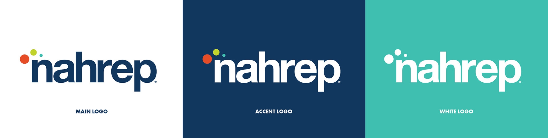 New lowercase logo system
Project overview
Modernizing an established advocacy brand without losing its roots.
The original logo helped establish NAHREP as an important housing advocate. As the organization evolved and further defined its role in housing and economic empowerment, the board felt it was time to modernize the logo in a way that reflected a broader focus while maintaining a strong connection to the organization’s history.
Balanced modernization with continuity for an established organization.
Translated mission pillars into a simple visual concept.
Expanded a monotone identity into a vibrant, flexible palette.
Built a rationale employers can connect to strategy, not only aesthetics.
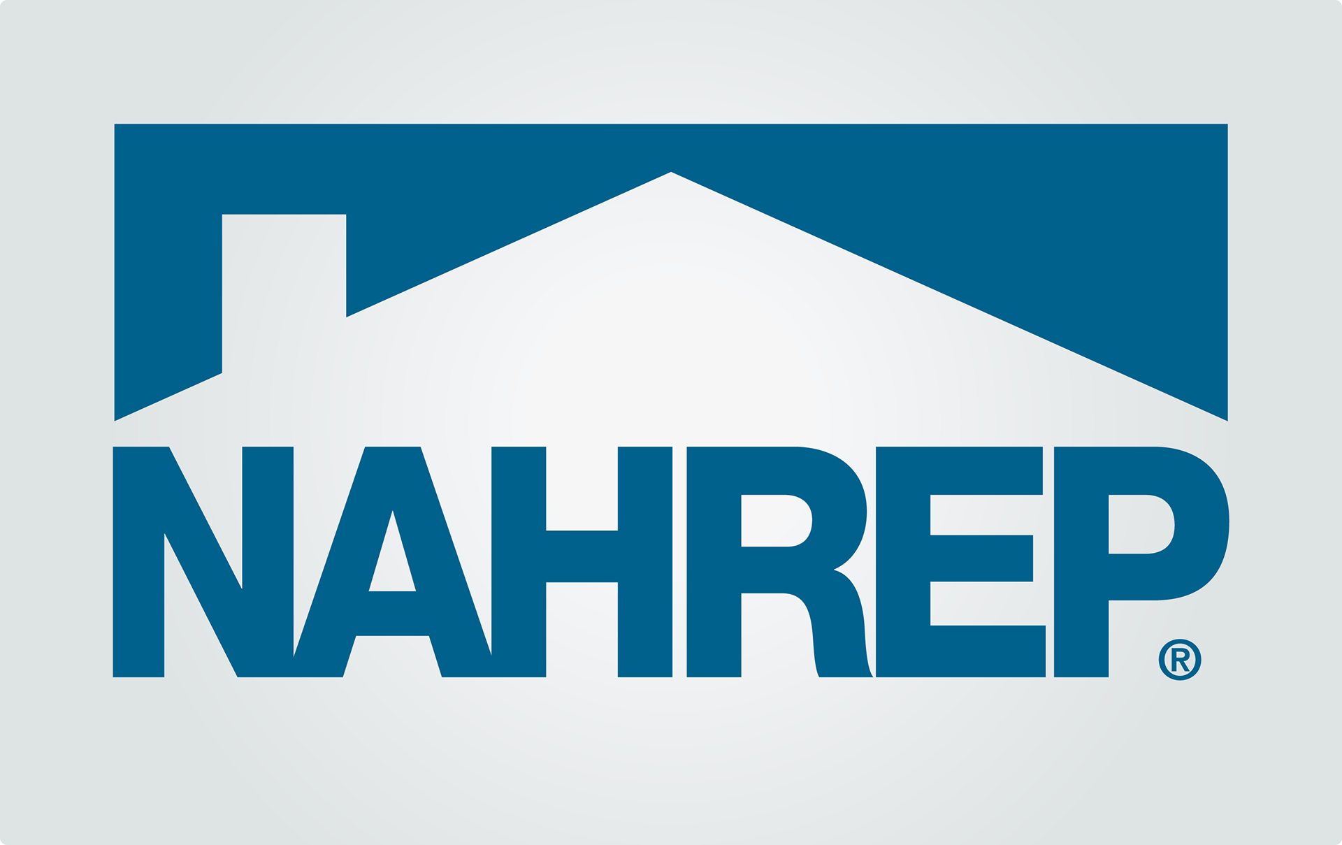
Previous logo
Starting with what already worked.
NAHREP’s original logo included the roof of a house, a nod to its mission within the housing industry. As the organization grew, the identity needed to become more inclusive of the broader role NAHREP plays in housing, real estate, economic empowerment, and community.
Fonts and colors
Using color and type to shift the tone of the brand.
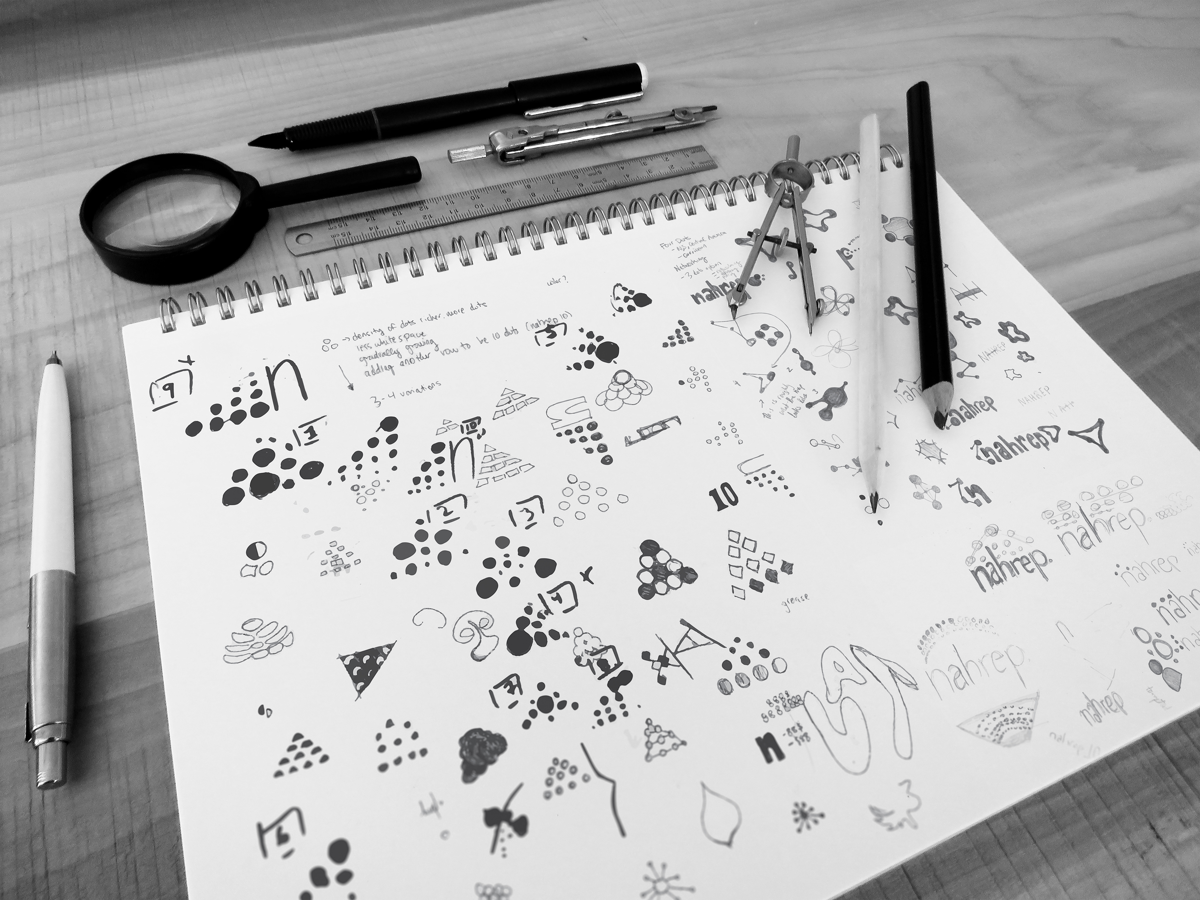
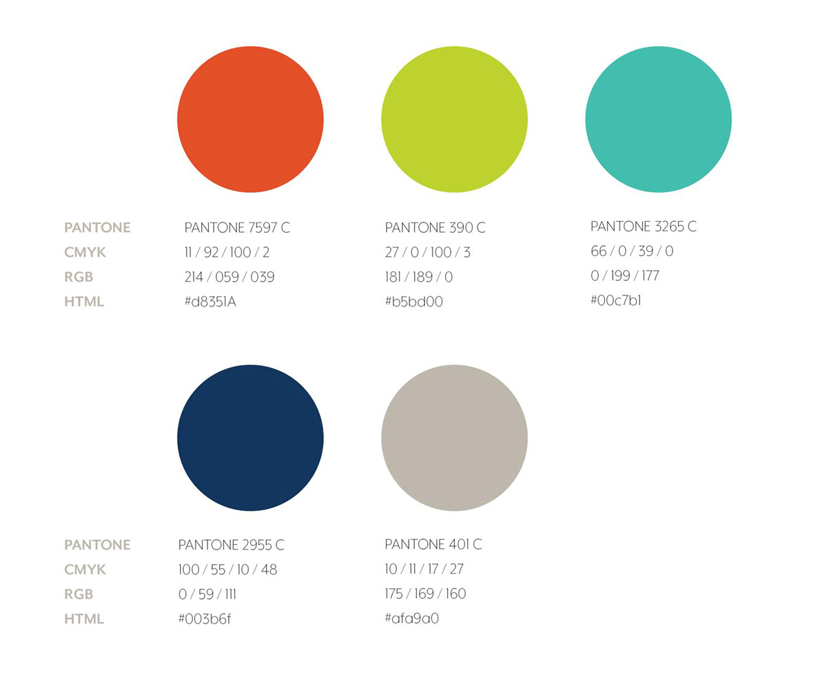
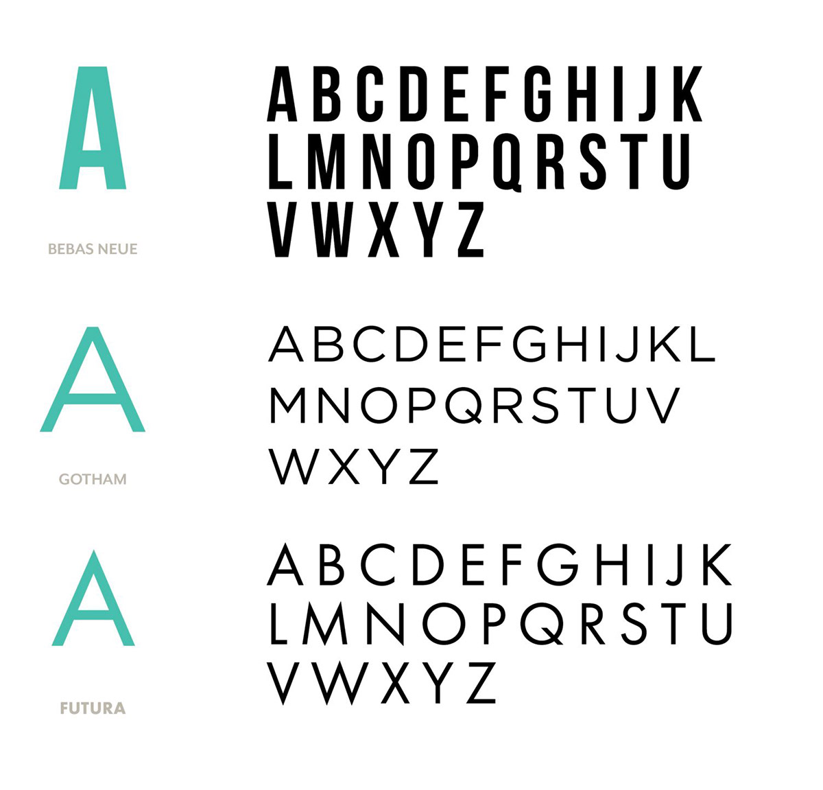
Breaking away from NAHREP’s original monotone brand, the new concept introduces vibrant colors that reflect the organization’s culture and energetic membership. Futura became the primary font, modernizing the company’s image.
Bringing it all together
A final mark with mission built in.
The three colored dots above the N represent NAHREP’s mission pillars: education, advocacy, and networking. Their placement also suggests a roof, preserving a connection to the organization’s real estate foundation.
Next project
shopHER