
Brand identity / custom typography
Cup O' Jazz Branding
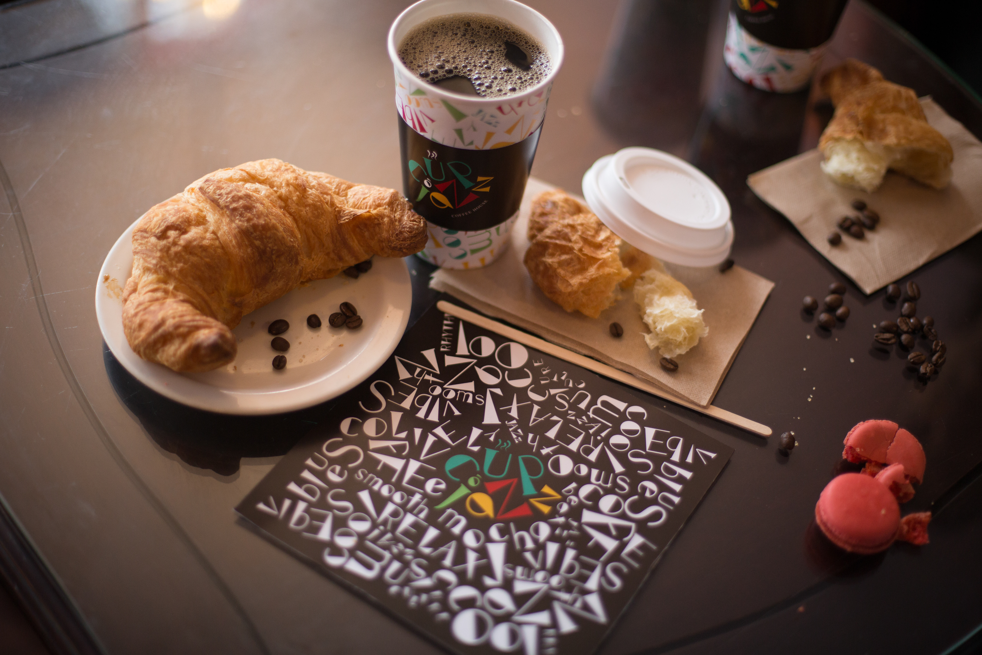
A coffee shop identity concept built from an assigned music genre and reference typeface, then extended into a custom font, logo, cup design, posters, and collateral.
Project overview
Building a brand system from type, rhythm, and cafe culture.
Created in my Typography 3 class at San Diego State University, this project aimed to develop branding skills through the creation of a custom font, logo, and collateral for a coffee shop. The assigned music genre was Jazz, with Times New Roman as the reference font.
Translated an assigned music genre into a visual identity.
Used Times New Roman as the starting point for custom type exploration.
Extended the logo and letterforms across cups, posters, and collateral.
Presented the brand in a believable coffee shop context.
Typography system
Creating movement from letterforms.
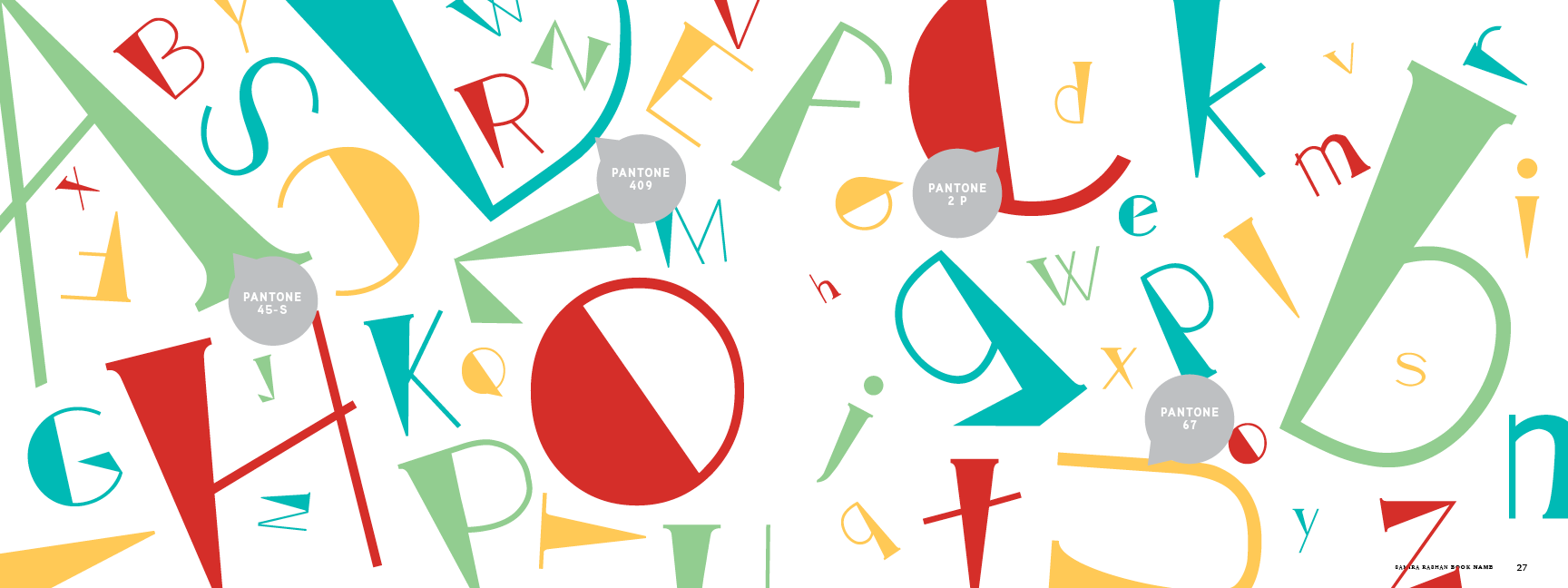
The custom type exploration uses sliced, oversized, and playful letterforms to suggest rhythm and improvisation. A bright palette gives the brand more energy while keeping the system flexible enough for packaging and promotional pieces.
Brand application
Turning the type system into a coffee shop mark.
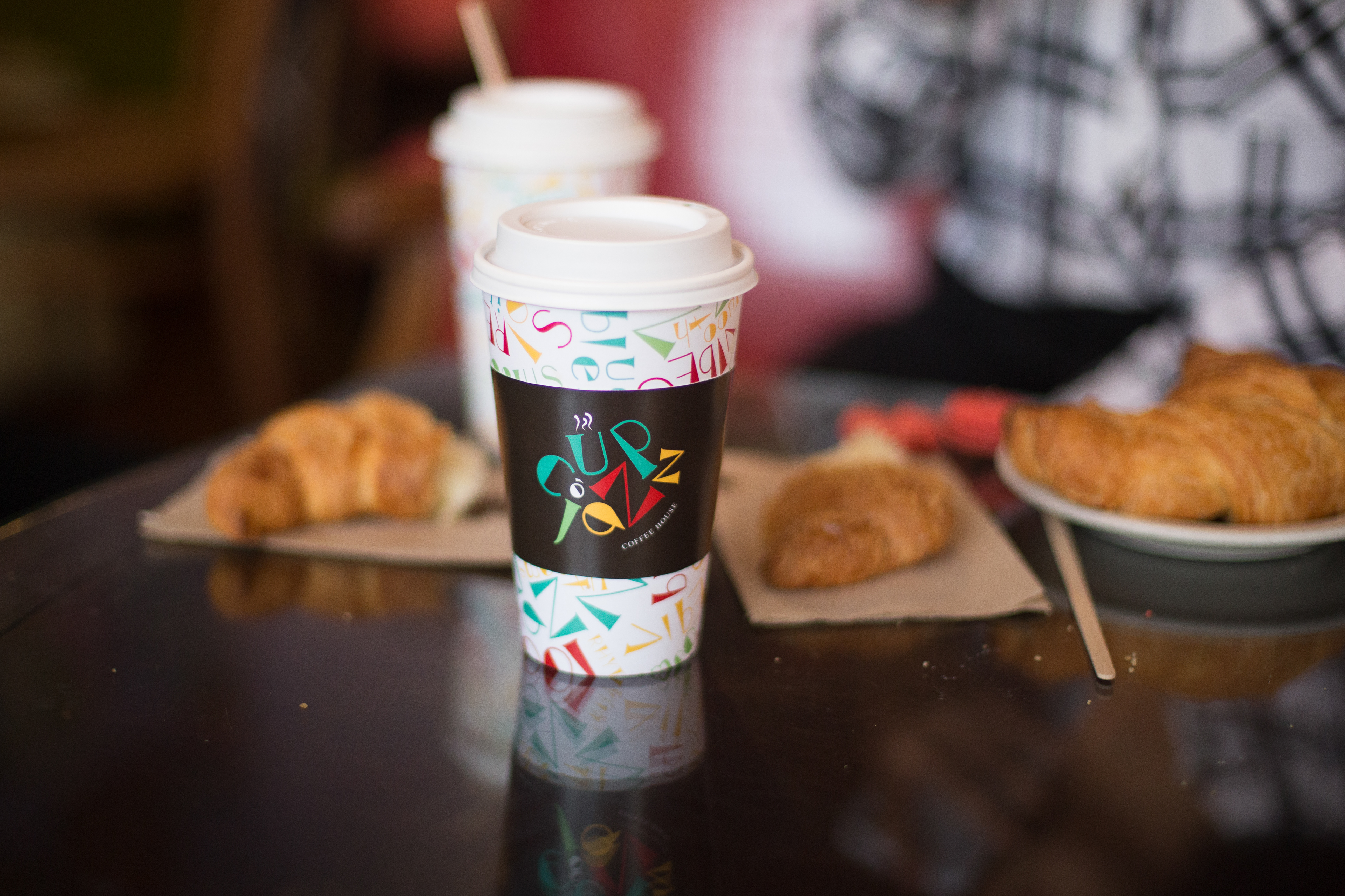
The identity comes to life on the coffee cup, where the custom type, pattern, and logo become an object someone could actually hold in a cafe environment.
Promotional design
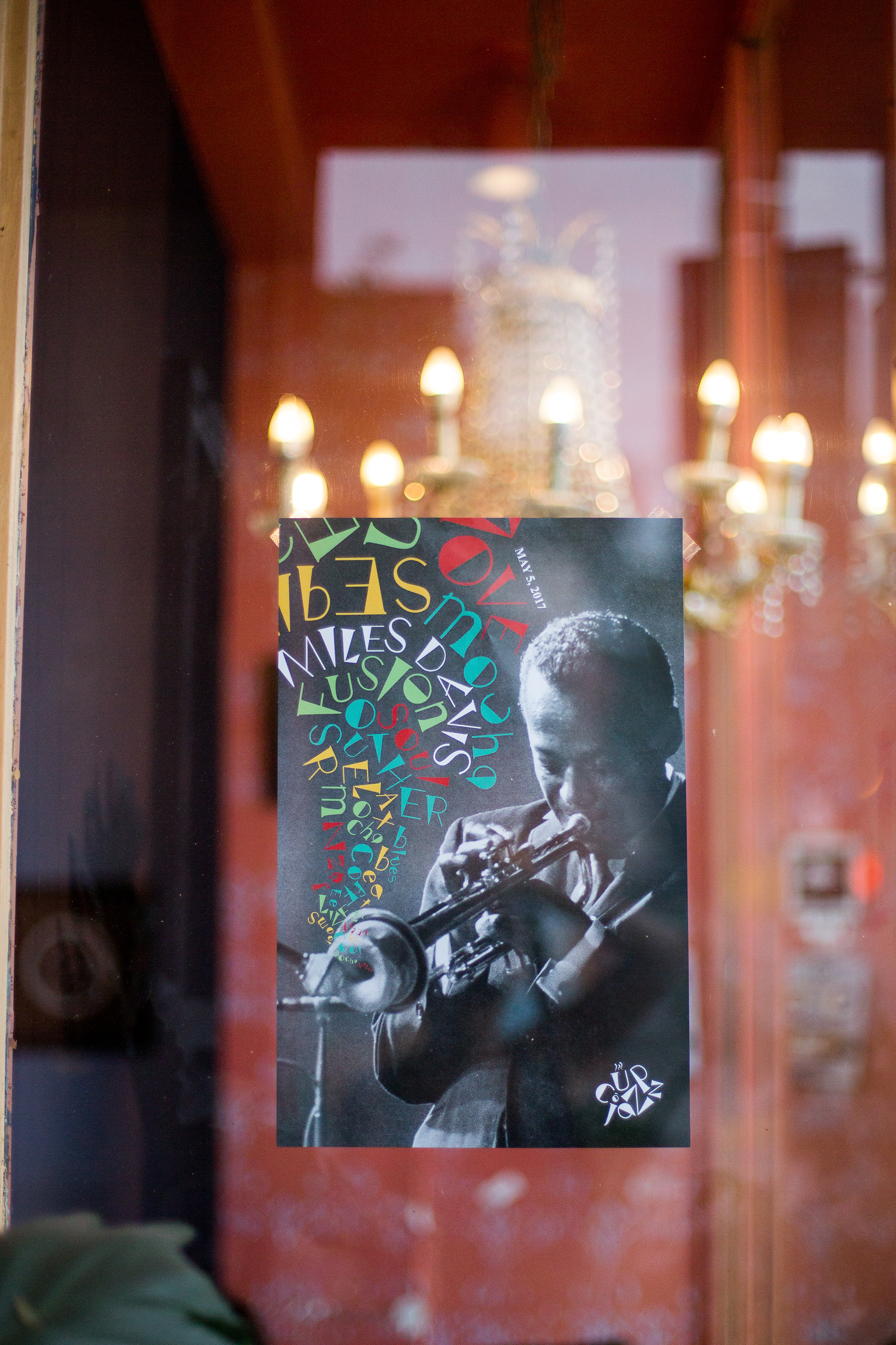
Jazz poster applications.
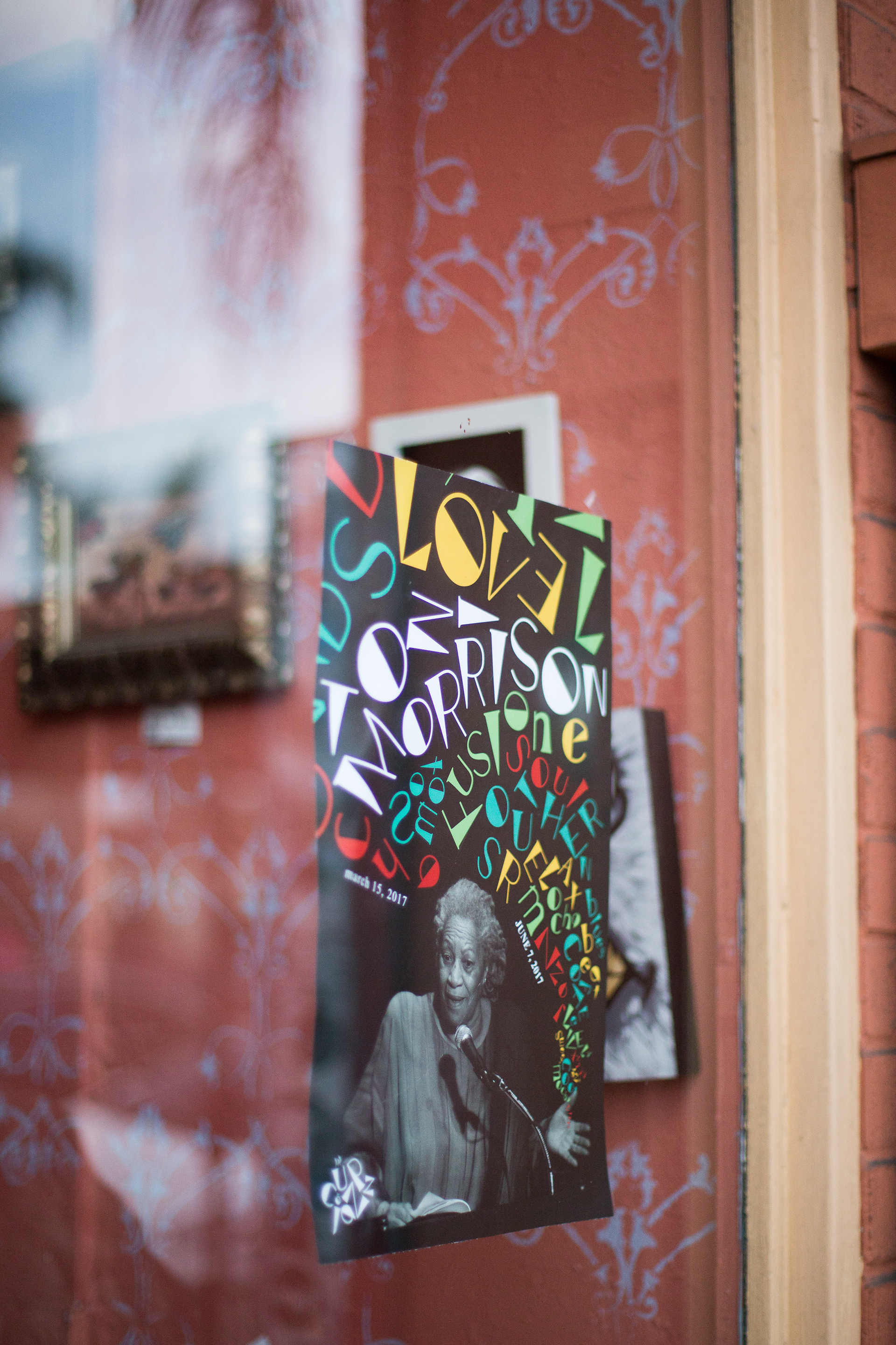
The poster applications show how the type system can adapt to music-focused promotional graphics while still feeling connected to the coffee shop identity.
Final presentation
A branded cafe moment.
The final photos pull the system together as a believable coffee shop identity, showing the cup, logo, typography, food styling, and collateral in context.

Back to portfolio
View all work